(Edited: 2025 April 10)
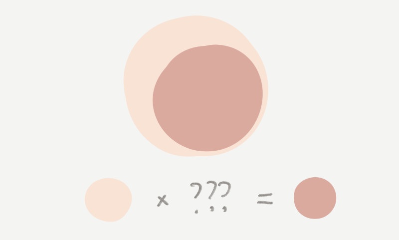
Consider this: You’re a certain kind of artist who uses Clip Studio Paint or Photoshop or Procreate or whatever. And you color by separating your base color from the shadows and highlights. And you use a Multiply layer for the shadows.
You’re scrolling through some art, or you have a reference in front you, and it has a certain combination of base color and shadow color that you like. It looks great and you want to copy it. But you want to use a Multiply layer for your shadows.
What color should the shadow be? Is it even possible? How do you find out?
First thing: Using a multiply layer is doing actual multiplication on the color values of the pixels.

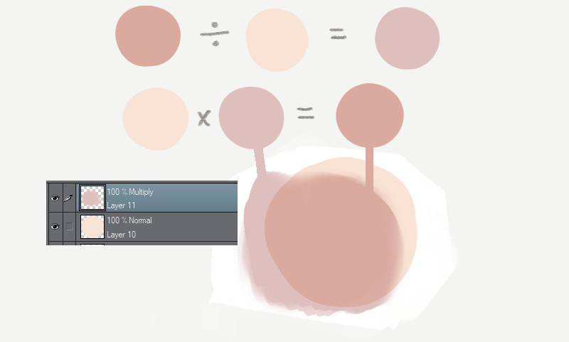
Second thing: As long as the resulting colors weren’t smushed out of the range of possible colors in your app, reversing it is as simple as using the reverse layer mode and ordering the layers correctly.
If you eventually want to use a color for a Multiply layer, you can use a Divide layer to find out what color to use.
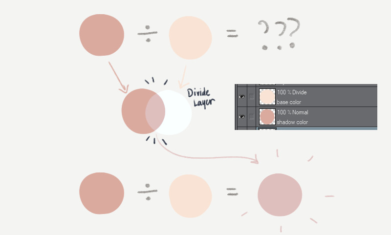
Divide the darker color with the lighter color. Lighter layer on top. Darker layer below. Overlap the layers, then you’ll get the color you want!
If you’re like me, you’ll tend to forget and have to think about it every time until you think of a mnemonic. So just remember this: The bright sky is above you; so the lighter layer is on top.
Use this new color for your eventual Multiply layer.
This also works for Add and Subtract layers. (in Photoshop, “Add” is called “Linear Dodge (Add)”.)
That’s really all you need to know to solve that problem in most cases.
There are cases where this doesn’t work, like if the colors are a bit extreme, you lose some precision. Or if the shadows in the original image weren’t actually achieved using Multiply, and some of the components of the shadow color are actually brighter than the base color, then it’s not a effect that’s achievable using most photo editing apps’ Multiply.
Anyway, everything below this is trivia for nerds.
Trivia Time
Wait a sec.
The multiply-divide thing doesn’t make immediate sense. If you multiply two numbers, numbers get bigger! But if you use a Multiply layer, colors get darker (color values are lower). Why do colors get darker instead of brighter?
Here’s the thing: Colors are usually presented as RGB values ranging from 0 to 255. This is called “8 bits per channel” where each component or channel of RGB is given 8 bits, or a value that fits in the range of 0 to 255.
But layer blending operations are actually done with “continuous” RGB values ranging from zero (0.0) to one (1.0)
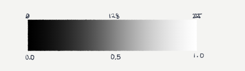
If you multiply a middle gray with a middle gray, 0.5 x 0.5, you get 0.25, a darker gray.
But after blending, it always gets converted back to 0-255.
Other blend modes have more complicated formulas so it’s trickier (and sometimes impossible) to reverse them and get colors that way. Other factors can also get in the way of letting you recover colors.
Smushed out of range
Remember when I said “as long as the colors aren’t smushed out of range”?
This is an unfortunate effect of how most image editing programs work. If you use certain colors, it’s pretty easy to blend colors using brightening or darkening layers, that resulting colors (or individual components of colors) can go beyond 0 or 255, or 0.0 and 1.0. Unless your program supports high-bit-depth documents (eg, 32 bits per channel), the program usually just discards this information and just gives you 255 or 0. Whichever direction you went too far in.
This is a bit of a contrived example but it demonstrates something that can happen often.

Notice how the red and green components quickly move towards zero. And the largest component sticks around.
One takeaway here is that dividing or multiplying using the zeroes from these resulting colors gives you information that’s unusable.
The other takeaway is that if the color components get dark enough, you already start to appreciably lose information . The 0-255 pixels use whole numbers; the results of multiplication and division are rounded off. The closer the values are to zero, the proportionately larger the rounding errors become.
You can sorta make do most of the time though. This loss of information usually just happens with colors that are very saturated, very bright or very dark. For example, it’s easy to max out color components when you use an Add blend mode. Colors turn white, or a really pure yellow, red, blue, green, cyan or magenta.
This can mean more than just a loss of information. It can unintentionally saturate colors that you didn’t mean to.
Color-saturating like this does happen in real life. When light passes through an object or medium, but not completely, it absorbs certain wavelengths and reflects the rest. This commonly causes the color to be visibly more saturated. You’ll find this in phenomena like Subsurface Scattering.
Color Spaces
There’s also an additional complications about color in photo editing apps that mean you shouldn’t extrapolate too much from this layer color math.
- Most art and photo editing apps do calculations in Gamma Space (see Gamma Correction). This is a conversion they do to the color numbers that make it more convenient and efficient for editing and viewing and encoding, but actually incorrect in terms of physical amounts (eg, the physical amount of light). Old game engines also functioned this way but modern games calculate lighting in a more plain and physically accurate Linear space.
- High Dynamic Range (or HDR) is the blanket term they give to the way some content has colors that are beyond 8 bits per channel. If you can imagine most old programs only using colors from 0 to 1. HDR means the data or the screen is capable of representing colors that are way beyond 1. Some professional apps like Photoshop can handle HDR image editing. But apps like Clip Studio Paint and Procreate don’t. Modern game graphics are calculated in HDR space and often flattened back into non-HDR colors so they can be shown on non-HDR (also called SDR) screens; a process is known as Tonemapping. This flattening also occurs on all modern cameras that save as JPG or PNG, including smartphones. The wide color data the camera gets from the real world passes through a tonemapping function that bends the colors to fit into a narrow non-HDR space. Photographers use the raw (wide) data from their cameras and use apps like Lightroom or Darkroom to adjust tonemapping manually so they get the SDR image that they want.
Related reading:


Leave a comment